Made to be yours.
A visual language that turns an everyday control panel into something distinctly your own.
A new perspective on Pterodactyl.
Designed to feel as good as it looks.

A visual language that turns an everyday control panel into something distinctly your own.
Thoughtful layouts put the controls you need where you expect to find them.
From the first login to the last command, each interaction deserves attention.
A theme should do more than look good. It should make every moment inside your panel feel considered.
Make it unmistakably yours. Explore a direction where a panel's colors, identity and appearance work in harmony with your brand.
Explore the design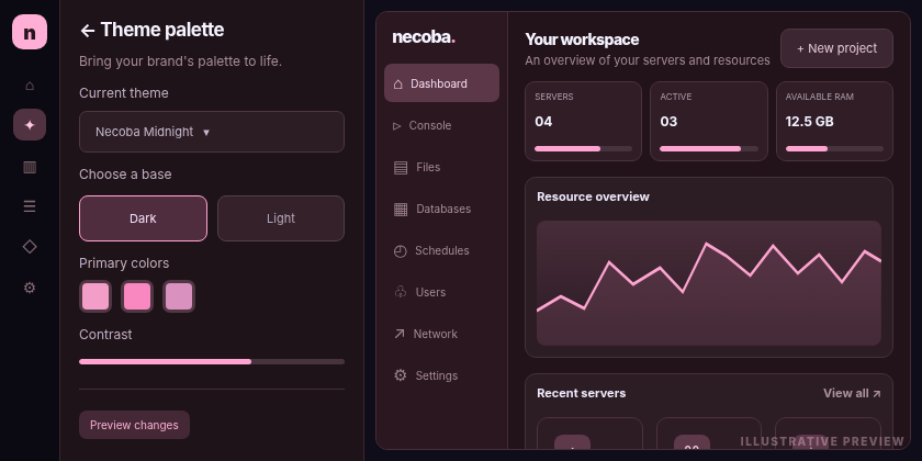
Move at the speed of thought. A cleaner navigation system and familiar patterns help you get to your work without getting in the way.
See the workflow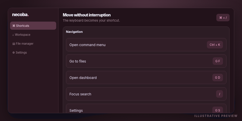
Discover the atmosphere of Necoba in our interactive style studio. Change the palette, spacing and workspace preview, instantly.
Welcome back
FiveM / Roleplay
[13:40:12] [INFO] Starting Necoba preview environment...
[13:40:14] [INFO] Loading visual components.
[13:40:16] [SUCCESS] Interface preview is ready.
[13:40:17] [SYSTEM] No real server connection.
Server / Workspace
Thoughtful interfaces. Clearer decisions. A product identity of its own.
An experience built around your own visual identity, from the sidebar to the finer details.
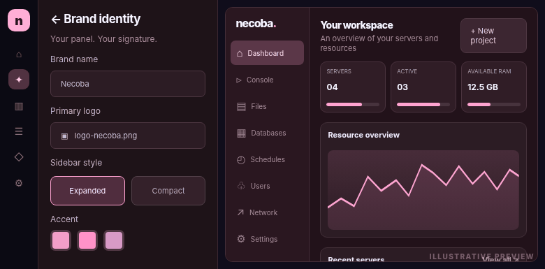
Well-positioned status messages and announcements that feel like a natural part of the interface.
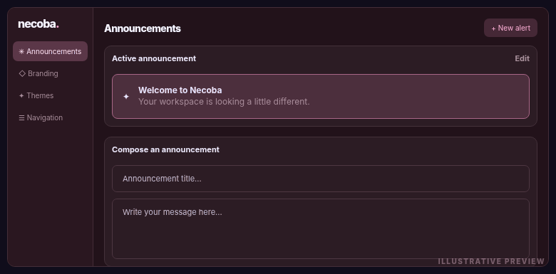
A more legible workspace for the files and folders behind your projects.
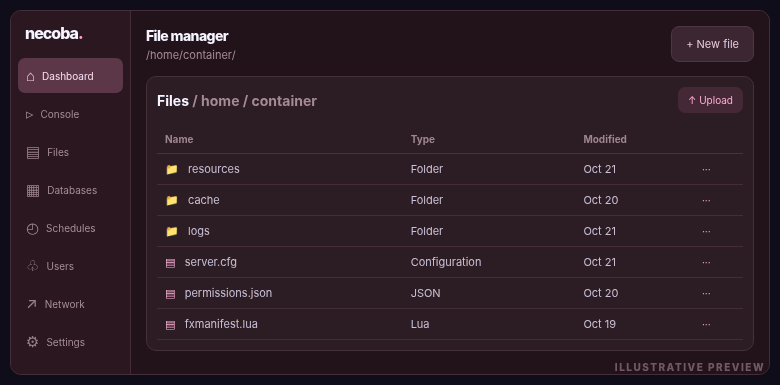
A consistent visual direction for everyday server administration and operational oversight.

From your personal workspace to server controls, every screen is part of the same story. The table describes the design direction, not a feature-availability guarantee.
Browse previews| Experience area | Conventional UI | Necoba direction |
|---|---|---|
| Visual identity | Standard panel branding | Unified brand system |
| Navigation | Utility-focused | Clarity-focused layouts |
| Server workspace | Native presentation | Considered visual hierarchy |
| Administration | Traditional interface | Consistent product language |
| Responsive design | Baseline layouts | Mobile-first refinements |
This is a visual concept comparison. Features shown in illustrations may be planned or under development.
Whether you manage a gaming community or a collection of services, good design should stay out of your way.
Keep important controls visible. Make room for the servers and worlds your players care about.
•••••Community hostingClear files, organized navigation and an environment that feels built for getting things done.
•••••Build and deployYour panel is part of your brand experience. It should feel like it belongs there.
•••••Brand consistencyA more approachable workspace helps the people keeping the infrastructure running focus on what's important, not on the interface.
•••••Day-to-day operationsA distinctive visual identity can make the difference between a generic tool and a place that feels like home.
•••••A unique identityThoughtful presentation and familiar controls are just as important behind the scenes as they are on the homepage.
•••••Platform managementFrom server console to configuration files, the daily workflow should feel connected.
•••••Roleplay and multiplayerCompact navigation, quick access to logs and a clear view of each service's state.
•••••Apps and automationNo matter what you're hosting, the best interface is one that grows with the way you work.
•••••Your space, your rulesThese are examples of who the design is intended for, not customer testimonials or verified product claims.
A collection of visual directions for the way Necoba could feel across your panel.
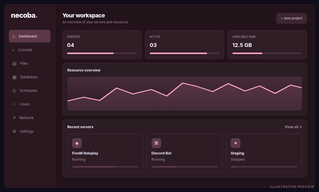
Your servers, your priorities, right where they belong.
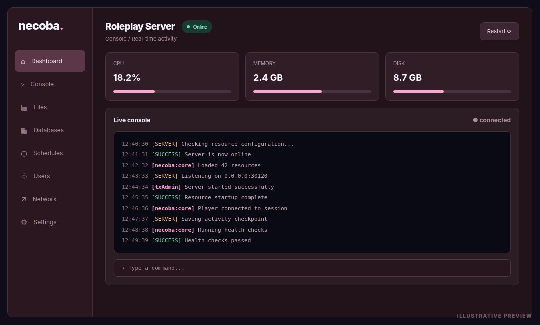
Make room for the things that matter.
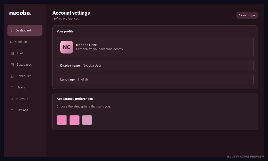
A home for your identity and preferences.
A different perspective on administration.
Everything in reach, nothing in the way.
Visual concepts — replace the images in assets/images/ with screenshots of your own Necoba build.
Your hosting panel says something about your brand. Make every screen count.
A clear interface lets your team focus on its servers instead of fighting the software. Necoba's design direction is all about making the everyday feel effortless.
Explore the galleryHave feedback, a question or an idea for the project? Speak directly with the team behind Necoba.
Send us a message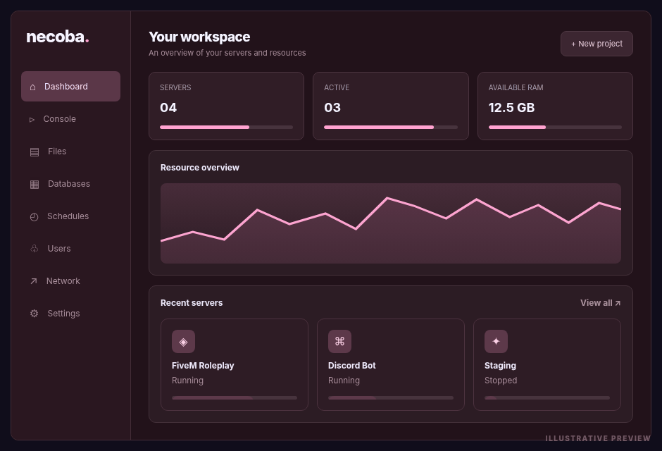
Everything you need to know about this preview website.
No. The interactive studio is a visual demonstration. Changes here never modify your live panel or server configuration.
Yes. Replace the image files in assets/images/ using the same names. The site updates without editing the layout.
Yes. Replace assets/images/necoba-wordmark.png with one transparent PNG containing your symbol and full name. This same file is used in the hero and footer.
No. It is a standalone frontend made from HTML, CSS and JavaScript. Upload it to a separate web hosting location, not inside the Pterodactyl panel files.
Explore the Necoba design direction or speak with the people behind the project.